Our Challenge
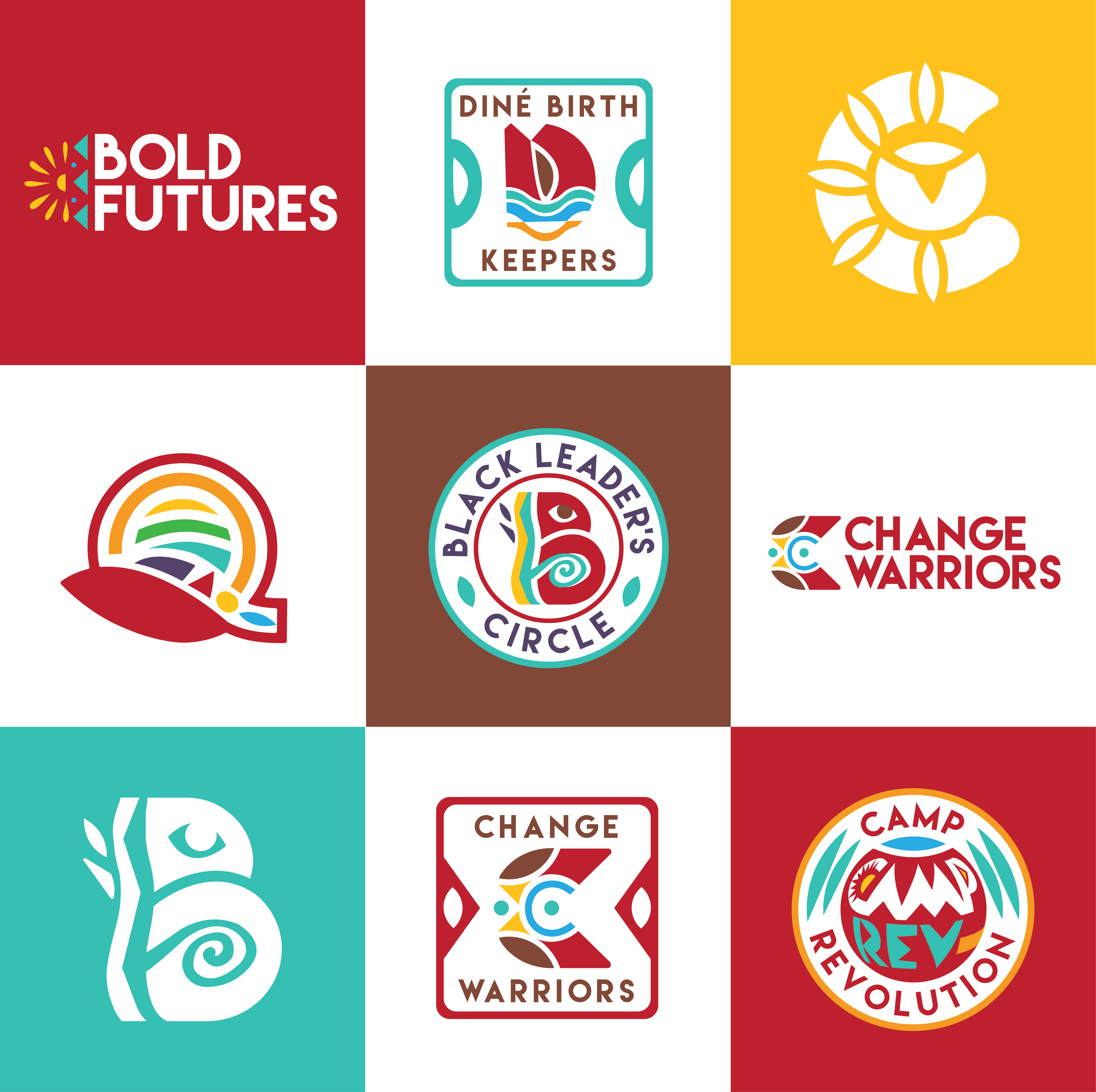
Bold Futures, a New Mexico-based reproductive justice organization, leads work at the intersection of policy change, place-based organizing, research and culture shift by and for women and people of color. Central to this work are their Touchstone Leader groups, community-led cohorts that bring lived experience to the forefront of Bold Futures’ advocacy. Our challenge was to create a visual identity system to reflect the shared mission of these groups under the Bold Futures umbrella, while also honoring their distinct voices, values and experiences.
Our Solution
We began with an extensive listening and learning process, meeting directly with each of the Touchstone groups to understand their stories, symbols and aspirations. Across conversations, shared themes emerged: healing, multi-generational family, connectedness, continuity, pride and joy. These became our guiding design principles.
To ensure authenticity, we referenced texts such as “Decolonizing Graphic Design” by Cheryl D. Miller, “African Art and the Colonial Encounter” by Sidney Kasfir and “Indigenous Sovereignty and Design” by Sadie Red Wing. These resources helped us challenge our own assumptions and center BIPOC design traditions.
We created six distinct logos, each rooted in the symbolism surfaced during our dialogues, and refined them collaboratively with the groups. The system uses Bold Futures’ bright and varied color palette and the bold Lemon Milk typeface to maintain a strong connection to the parent brand. The result is a cohesive visual system that honors both unity and individuality, allowing each group’s unique identity to shine within the collective power of Bold Futures.

“Bold Futures NM reached out to Barefoot PR for help developing branding for our Touchstone Groups. It was critical that these “sub-brands” reflected the communities they represented, while also maintaining cohesion with the Bold Futures brand. The Barefoot PR team went above and beyond to engage with our staff and community leaders with great care, compassion, and enthusiasm! The designs that emerged are beautiful, creative, and meaningful representations of the deep community work we are committed to. We can’t wait to work on the next big project with Barefoot PR!”
- Charlene Bencomo, Executive Director of Bold Futures


