Understanding website accessibility can seem like an overwhelming task, particularly for those without experience living with a disability. We’ve seen estimates that as much as 20% of your audience at any given time may be experiencing a disability of some kind, which means you may be ineffectively communicating with 1 out of every 5 people who visit your website.
We look at web accessibility like we look at curb cuts: sidewalk ramps are essential for those in a wheelchair, but they also benefit caregivers with strollers, people with roller bags and maybe even those with a bad knee. So we encourage you to look for ways that you can make your website better for people with disabilities, while helping a lot of other users along the way.
How do people with disabilities navigate the internet?
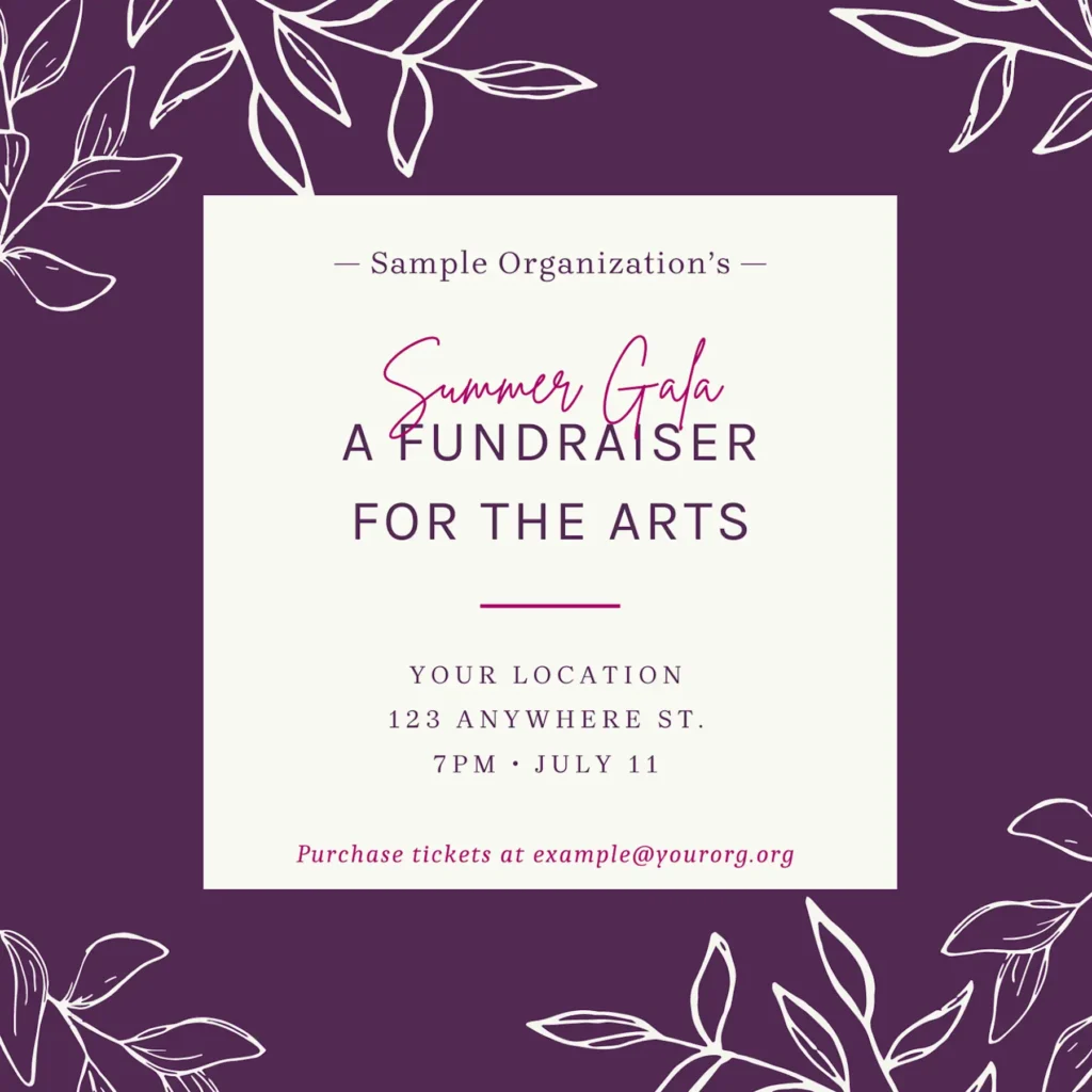
If you’re a sighted person, here’s an invite to an important fundraising gala that you might see when you visit your favorite nonprofit’s website:

If you’re relying on voiceover technology to hear content through a screen reader, you would hear the alt text provided by the website’s code. On a website not optimized for web accessibility, you might hear this:

What’s missing here?
Well, a lot! Not only do you not receive the time and date of the event, but you also don’t know how to RSVP or buy tickets. When someone using a screen reader cannot perceive all of the information or content that a sighted person would, that means your website is inaccessible.
Can’t a plugin or widget fix my accessibility issues for me?
Widgets can help in some ways, like making it easier to increase font size or color contrast. But Barefoot advises to make sure your website is accessible without using a widget, as there are many things a widget can’t fix, or could potentially make more confusing. For example, if you don’t have alt text included for your images, a widget can’t make it up for you. (Well, the AI ones can, but those results can be inaccurate).
OK, I want my website to be accessible, but where do I start?
Let’s start with some low hanging fruit – issues that are easiest to fix. Alt text is one of them! Review the alt text included in your web photos, and make sure the alt text tags are concise but descriptive. You really want to convey the meaning of the image. Think about how you would feel if you heard “headshot” over and over while going through a staff page – that’s not descriptive at all! Leave alt text blank if the image does not add any value or context.
Headings
Make sure each page on your site has one <h1> heading, and that subsequent headings are nested within. Do not skip from <h1> to <h4>, for example. People using screen readers sometimes use headings to navigate through a page, much as a sighted user would skim content, so it’s important that the heading order makes sense.
Links
Make sure your links are descriptive. “Learn more” doesn’t really tell you much about where you’re going if it’s taken out of context. Everyone has been surprised before when clicking a link that takes you to an unexpected place! Make it more clear for everyone by using “Learn more about our programs” instead.
Keyboard navigation
Website accessibility isn’t only about screen readers. It also covers mobility. Some users are unable to use a mouse, and instead navigate through a website using a keyboard. This is an easy thing to test on your own site – just go to it and start pressing “tab.” You should be able to click on links using “return.” Pay special attention to accordions and tabs – if you can’t open them using “return” or “spacebar,” folks using keyboards might be missing out on a lot of content.
Focus Indicator
When you ran your keyboard test, did you have a hard time understanding where you were on the page? You might need a better focus indicator! The default on browsers is typically a faint gray dotted box. Go ahead and make yours bold and colorful – people won’t be able to see it unless they are navigating by keyboard and need to. Add this code to your website’s CSS – you can switch out #008375 with one of your brand colors, provided it has enough contrast against white:
*:focus-visible {
    outline: 3px solid #008375;
    box-shadow: 0 0 0 1px white, 0 0 0 4px #008375, 0 0 4px 8px white;
}
Color Contrast
Color contrast is important for people with vision impairments, but let’s face it, we’ve all squinted and struggled to see something on a site without enough contrast before. You want to have text with color contrast that is at least 4.5:1, and while you’re at it, bump up your font size to at least 16px (but we prefer 18px). You can test your hex codes for contrast ratios at whocanuse.com.
Extra credit: We like to include accessible color combinations in our brand guides, like this one we developed below:

Understandability
The guidelines for understandability are admittedly not very specific, due to the range of cognitive abilities. However, you should still strive to avoid overcomplicated language or jargon-y words. This will also help users who may be unfamiliar with your brand!
WCAG standards
You’re on your way to making your website more accessible! For a full list of accessibility guidelines, check out the Website Content Accessibility Guidelines here.
That was all Greek to me!
You’re not alone! If this seems overwhelming, it’s probably time to enlist some help. When choosing a developer to help you make changes, make sure they are aware of website accessibility standards and how to implement them. This is especially important if you’re making the investment to redesign your site!
Schedule a 30 minute intro call to discuss a website accessibility audit, or how Barefoot can help with your website accessibility.
Written by Jinha Servais, Director of Design at Barefoot PR
