You may have noticed our philosophy and tagline “Public relations with purpose” has expanded to include design.
At Barefoot PR, designing with purpose means believing in the work we do and the clients we serve. It also means spending a lot of time listening to our client’s needs and channeling that into the designs we deliver.
When meeting with new clients, we emphasize this listening and learning exchange at the beginning of our work. We want our clients to see their purpose in practice as we create their new visual identity. Here are the steps the Barefoot PR team takes to design graphics and websites with purpose at Barefoot PR.
Listen and Learn
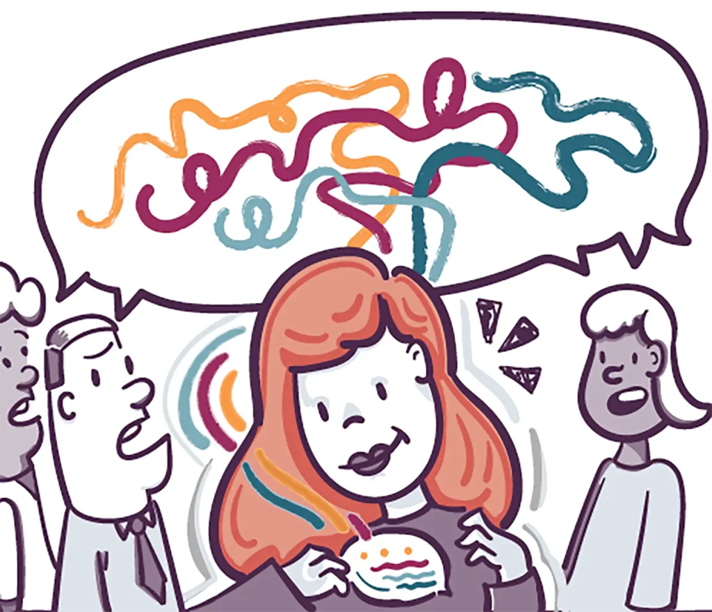
Clients come to us to figure out how their visual identity can be just as appealing and accessible as their messaging. To help them get there, we start onboarding meetings with a listening and learning session where we ask a bunch of questions informed by research. It sounds pretty self-explanatory, but it’s essential that we get to know our clients beyond what we read under the “About Us” found on their website. This creates an essential foundation for us to build upon.
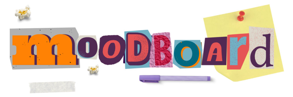
Many designers like to mood board before a project. A mood board is a rough and messy place where we can get our ideas down. Even though it’s scary to show our right-sided brains to our clients, we like to share our (slightly more organized) mess of inspiration before jumping straight into first-round logo concepts. We use a mood board to take the temperature and make sure they can visually track themselves in your creative process.
Consider Audience and Tone
At Barefoot one of our values is Words Matter. As designers, we know that the fonts matter too.
An organization’s brand is their opportunity to make a first impression. Depending on our client’s target audiences, they may need branding that looks more friendly, professional, vibrant or serious. The logos and fonts we choose can express a specific tone without explicitly saying it.
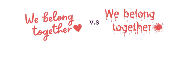
A rounded sans serif font is friendly, approachable, and modern. A serif font can be more formal, conservative, and traditional. Both speak to different audiences and express different messages. When we make these font decisions for our clients, it’s important we show our clients why we chose a font and what it says.
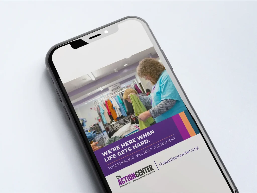
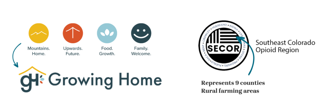
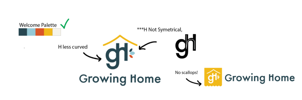
Logos can also require elements that speak to a specific audience. Take a look at one of the logo options we presented to Growing Home and SECOR. Both clients’ brands and missions focus on the communities they serve.
Can you spot the purpose?
We also consider accessibility when selecting fonts, preparing brand colors and designing websites. When the entirety of a brand is accessible, the barriers to viewing, understanding and belonging to an organization are removed and that brand can reach the largest audience possible.
Read more about why accessibility is important to us when we design websites here.
Reinforce Feedback
After each round of edits, we like to reinforce the feedback previously heard from our clients. Active listening ensures we can accurately incorporate their comments and edits into our next set of designs. It also helps them connect with and understand the creative decisions made based on that feedback. Show them how that feedback shaped your work!
When we follow each of these steps, we can feel satisfied knowing our clients are happy and fulfilled knowing every pixel is filled with purpose.